Design System
Modern Classic
Clear, modular, rational, and implementation-friendly.
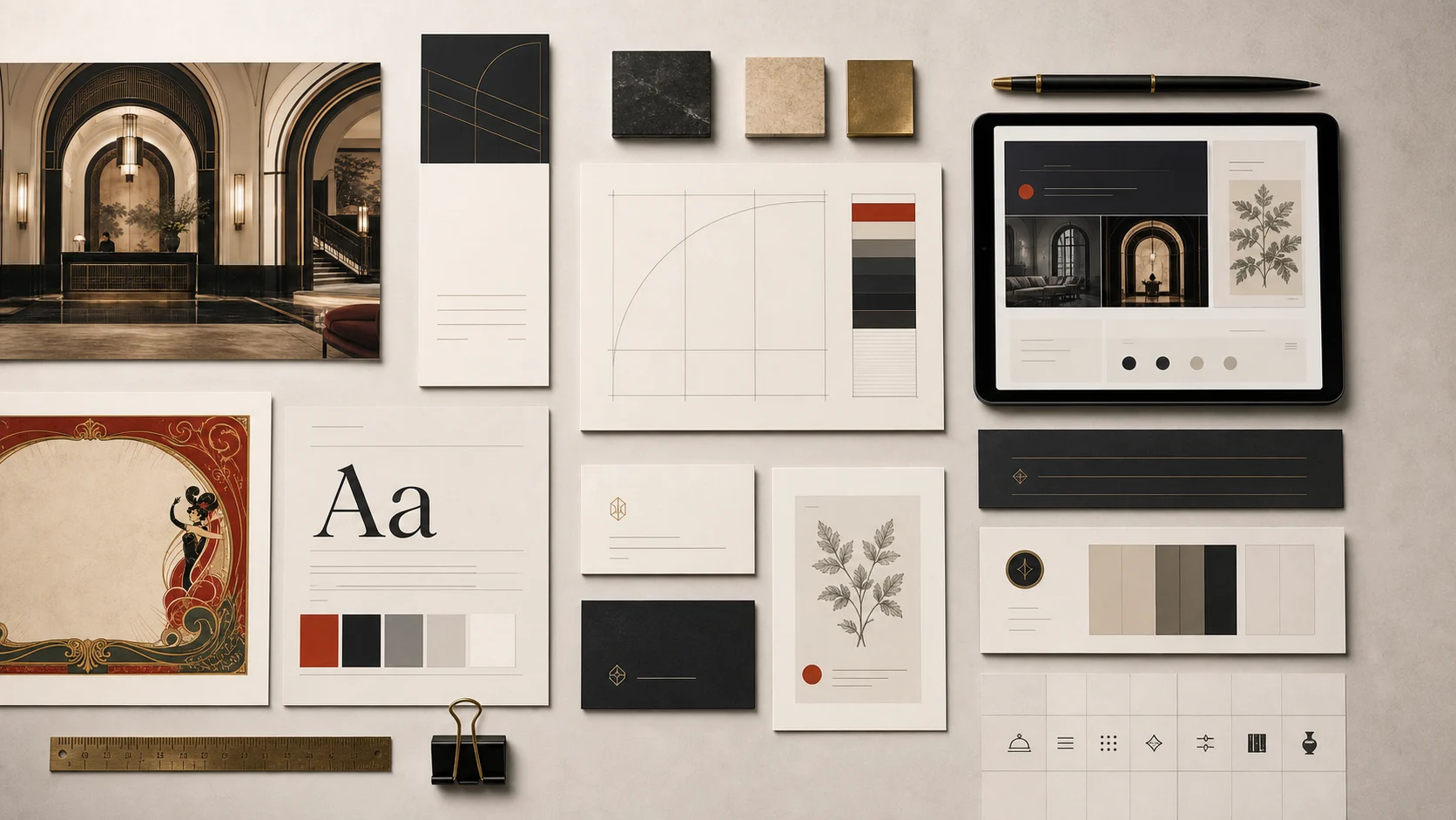
What is Modern Classic for?
A pragmatic counterweight based on Bauhaus, New Typography, modernist grids, information design, and identity systems.
Use Modern Classic when a website needs to feel Clear, Modular, Rational, Flexible and Implementation-friendly while still supporting practical pages for System foundations, Documentation, Component catalogues, Dashboards and Responsive rules. The system is designed for real commercial surfaces: reusable components, page sections, templates, prompt-tracked imagery, and documentation.
Primary package: @vui/design-modern-classic · Route: /design-systems/modern-classic
Character traits
- Clear
- Modular
- Rational
- Flexible
- Implementation-friendly
Best uses
- System foundations
- Documentation
- Component catalogues
- Dashboards
- Responsive rules
Visual language and examples
Visual language
- Catalogue hero and documentation-oriented preview.
Examples
- Catalogue previewA compact preview card for the design-system index.
Reference library
Modern Classic turns Bauhaus, New Typography, Swiss grids, and information design into the baseline system that keeps Vintage UI readable and reusable.
Research links
- Getty Research Institute: Bauhaus principles and curriculumReference for workshop-based design education, practical making, shared foundations, and holistic system thinking.
- Cooper Hewitt: A Harmony of ContrastsReference for Swiss Style: typography, sans-serif type, asymmetrical layout, grids, and photographic clarity.
- MoMA: Bauhaus, 1919-1928 catalogueBroad Bauhaus source spanning architecture, craft, typography, industrial design, theatre, and photography.
- MoMA: The New TypographyReference for Tschichold, modern typographic composition, and European avant-garde print systems.
Representative artists
- Herbert BayerBauhaus graphic designer and typographer · 1920s-1950s. Use for integrated typography, photography, identity, and information design.
- Laszlo Moholy-NagyBauhaus artist, designer, and educator · 1920s-1940s. Use for experimental media, construction, photography, and modernist systems thinking.
- Jan TschicholdTypographer and New Typography theorist · 1920s-1970s. Use for asymmetric composition, typographic discipline, and print systems that remain readable.
- Armin HofmannSwiss graphic designer and educator · 1940s-2000s. Use for contrast, grid discipline, spare form, and typographic control.
Work gallery
- Staatliches Bauhaus in Weimar 1919-1923Herbert Bayer and Laszlo Moholy-Nagy, 1923. A reference for publication systems, institutional identity, and cross-disciplinary modernism.
- Bauhaus Ausstellung Weimar 1923Laszlo Moholy-Nagy, 1923. A reference for concise modern event graphics and minimal but active composition.
- Plakate der AvantgardeJan Tschichold, 1930. A reference for asymmetric typography, strong red-black contrast, and exhibition-poster clarity.
- Swiss Style and Armin HofmannArmin Hofmann, 1940s-1950s. A reference for grid-led layout, typographic economy, and contrast as structure.
Implementation primitives
- Strong grids
- Asymmetrical composition
- Clean hierarchy
- Functional spacing tokens
- Direct forms and buttons
NPM package
Import from @vui/design-modern-classic.
Need package-specific docs and tokens? Use the package entrypoint in @vui/design-modern-classic.
Generated visual library
Visual notebook for Modern Classic
A working notebook of scenes, page plates, component specimens, material swatches, and reusable parts. Each group is placed by how it would be used in a real website, not by file count.
- 14Showcase scenesRead these as the destination: the business surface that proves the style can hold real hospitality, retail, or cultural content.
- 10Template previewsThese plates show page rhythm. The notebook keeps them larger so hierarchy, repeated sections, and commercial structure are legible.
- 10Component detailsComponents are the specimen drawer: controls, badges, plaques, labels, and navigation fragments that can be reused without turning into decoration.
- 9Material texturesTextures are not hero art. They sit like material swatches: quiet, repeatable, and close enough to judge surface quality.
- 42Cutouts and decoratorsDecorators are parts, not thumbnails. Corners, dividers, seals, tabs, and frames are placed by job so their use in a composition is easier to understand.
- 6Campaign platesCampaign pieces behave like public posters and launch cards: more theatrical, more vertical, and separated from reusable component parts.
- 4Responsive previewsResponsive previews are proof notes. They are grouped as device evidence rather than treated as another decorative image.
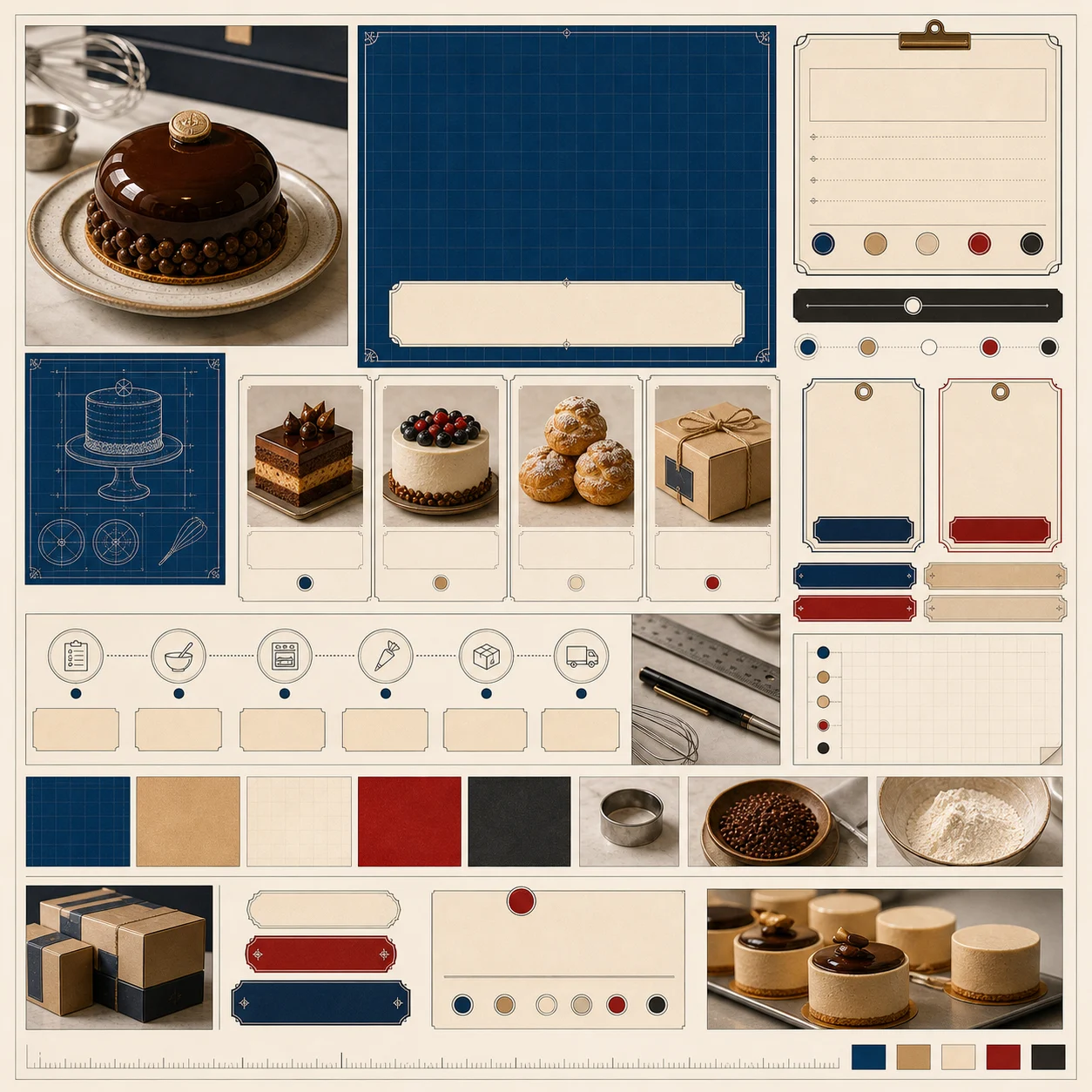
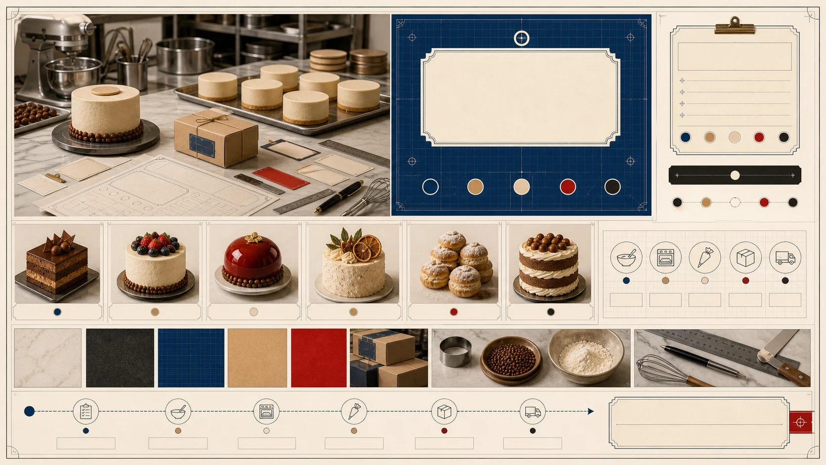
- 2Moodboard platesMoodboard plates summarize the period vocabulary: materials, type, color, and framing logic in one reference sheet.
Showcase scenes
Read these as the destination: the business surface that proves the style can hold real hospitality, retail, or cultural content.
Finished business scenes and hero imagery that show the design system in commercial context.
- Why it exists
- These scenes prove the style can carry a real service, product, or venue without becoming loose decoration.
- Feeling
- Immediate, inhabitable, and commercial: the visitor should feel the business could launch from this surface.
- Role
- Showcase scenes
- Count
- 14
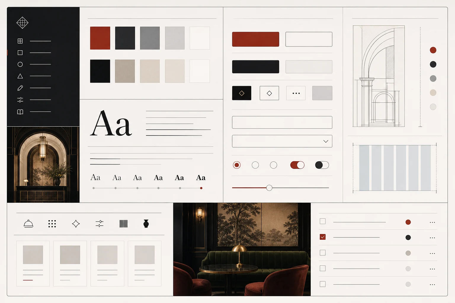
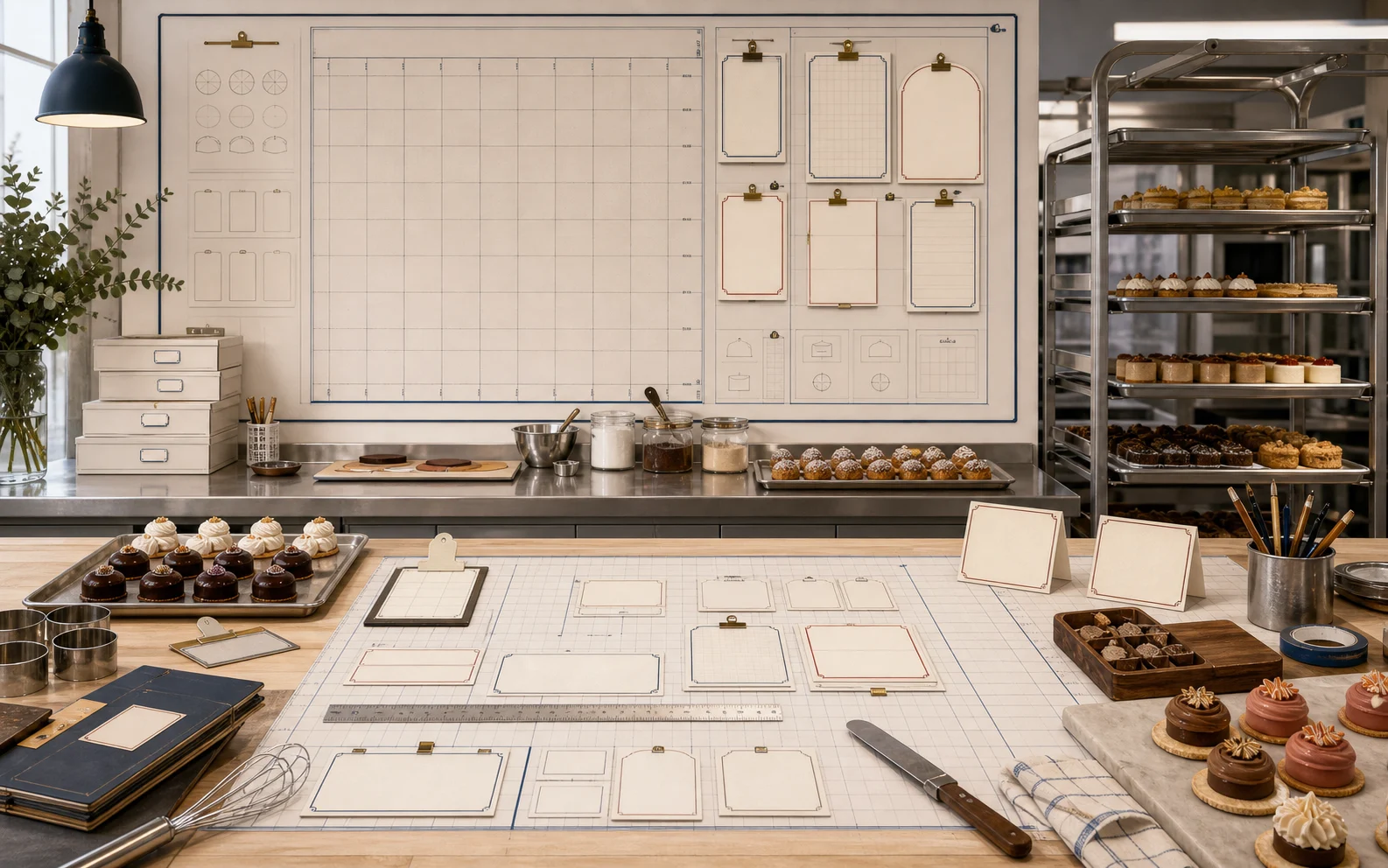
11 more prompt-tracked specimens
- Made-to-order studio consultation scene for commercial website storytellingBusiness Scene
- Production packing workflow scene for made-to-order service pagesBusiness Scene
- Production review wall scene for bakery lab or custom studio pagesBusiness Scene
- Made-to-order pickup and ordering workflow for service pagesBusiness Scene
- Production calendar and batch-prep scene for operational storytellingBusiness Scene
- Contemporary patisserie retail counter scene for catalogue, landing, and gallery usageBusiness Scene
- Contemporary patisserie packing and pickup scene for catalogue, landing, and gallery usageBusiness Scene
- Magazine-shop patisserie display scene for catalogue, landing, and gallery usageBusiness Scene
- Top-down seasonal patisserie product editorial scene for catalogue and gallery usageBusiness Scene
- Patisserie launch photography studio scene for catalogue, landing, and gallery usageBusiness Scene
- Patisserie subscription and gifting counter scene for catalogue, landing, and gallery usageBusiness Scene
Template previews
These plates show page rhythm. The notebook keeps them larger so hierarchy, repeated sections, and commercial structure are legible.
Full-page and saleable template compositions for evaluating page structure and visual rhythm.
- Why it exists
- These previews explain how the style becomes a complete page system with repeated sections and hierarchy.
- Feeling
- Ordered and evaluative: the page rhythm should feel clear enough for pricing, booking, browsing, or inquiry.
- Role
- Template previews
- Count
- 10
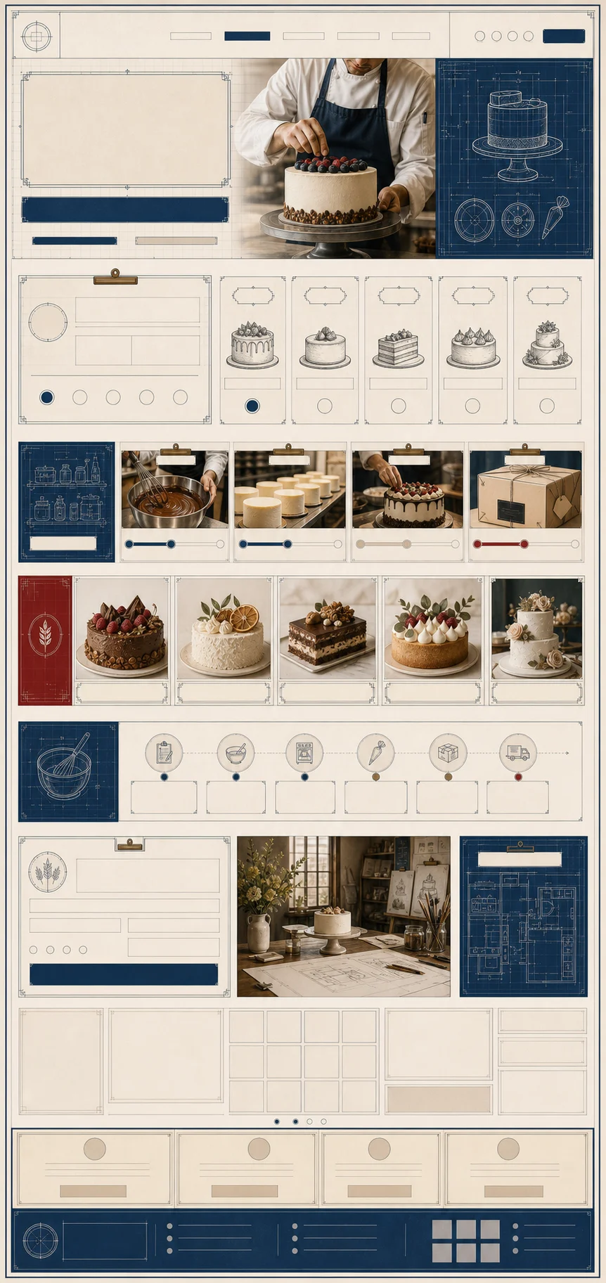
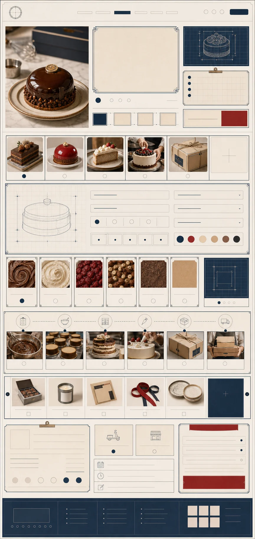
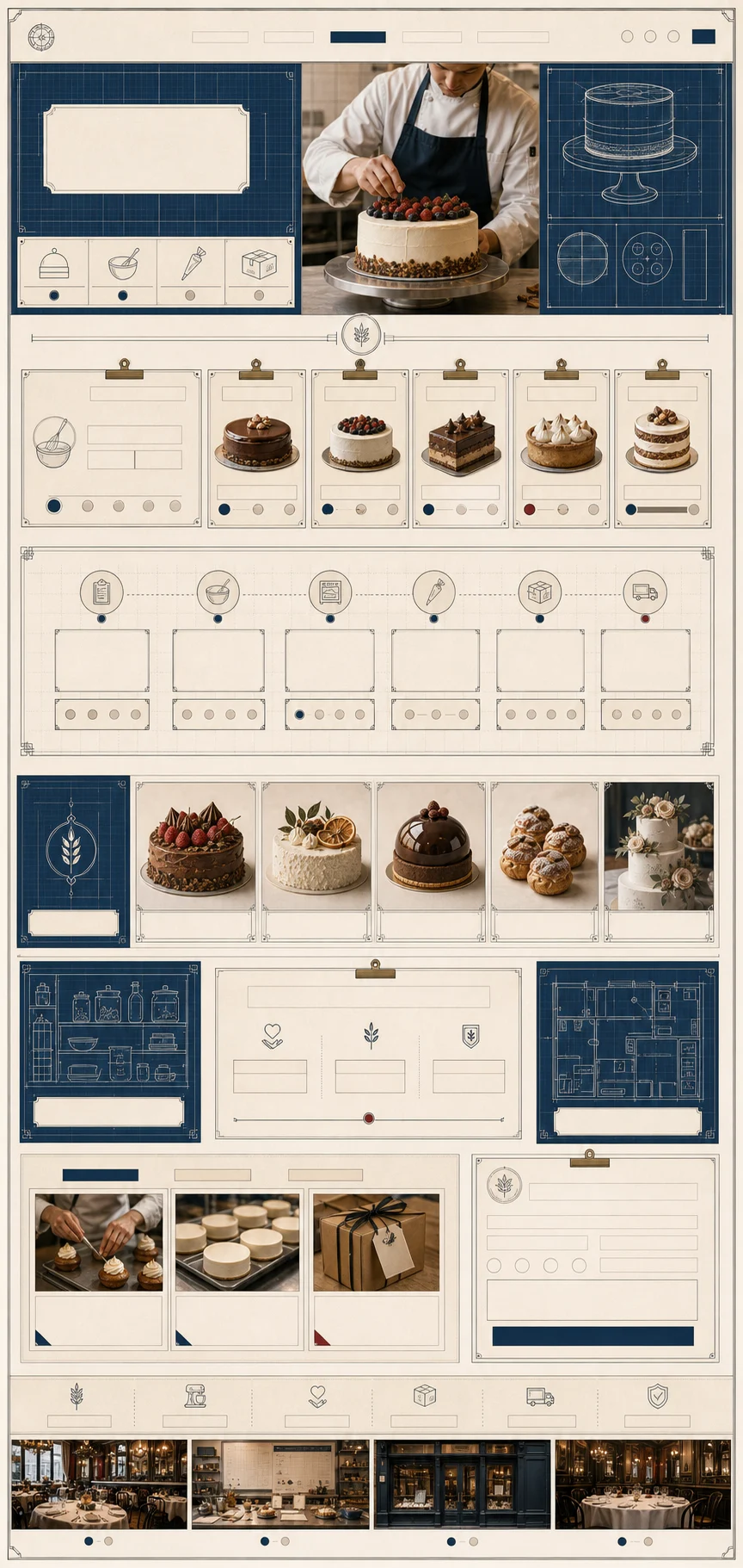
7 more prompt-tracked specimens
- Mobile-first template preview for bakery lab or craft studio pagesTemplate Preview
- Product catalogue and specification template previewTemplate Preview
- Full-page seasonal launch website template previewTemplate Preview
- Magazine-shop patisserie website template previewTemplate Preview
- Patisserie ecommerce collection template previewTemplate Preview
- Patisserie editorial article and shop template previewTemplate Preview
- Mobile-first patisserie landing template previewTemplate Preview
Component details
Components are the specimen drawer: controls, badges, plaques, labels, and navigation fragments that can be reused without turning into decoration.
Closeups of buttons, labels, menus, plaques, cards, and other interface parts.
- Why it exists
- These specimens show how the period becomes interface decisions at button, label, card, and navigation scale.
- Feeling
- Precise and reusable: each part should feel like it belongs in a kit, not like a pasted ornament.
- Role
- Component details
- Count
- 10
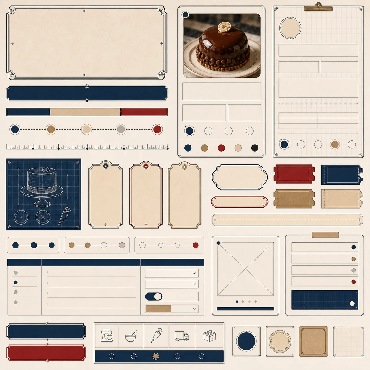
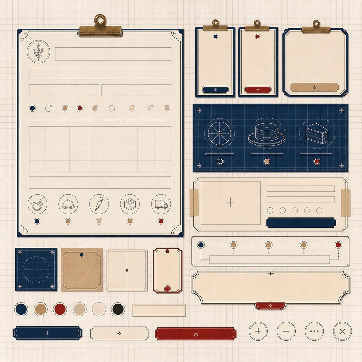
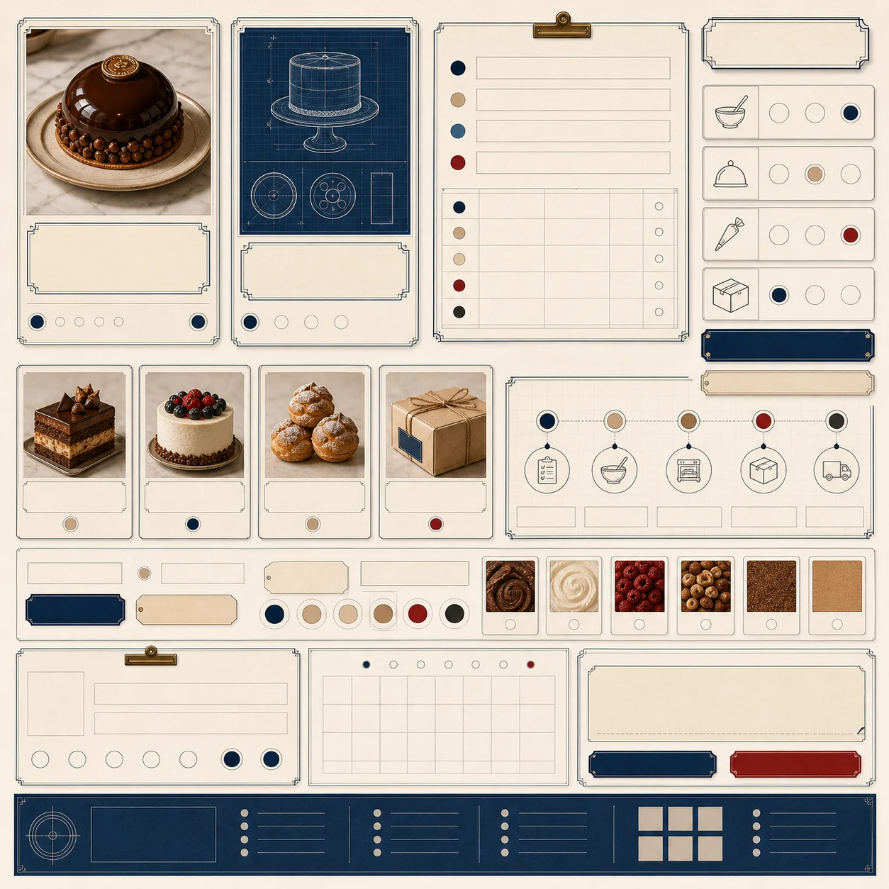
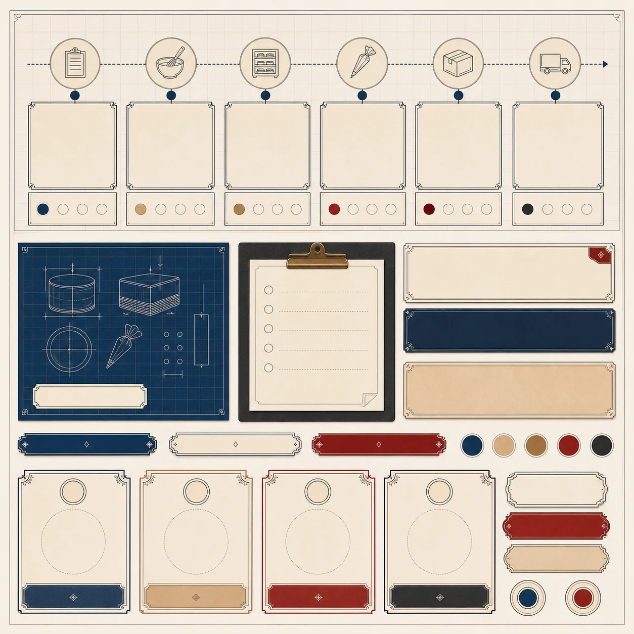
6 more prompt-tracked specimens
- Small-screen control component detail for order and specification modulesComponent Detail
- Flat patisserie product matrix component detailComponent Detail
- Patisserie pickup scheduler component detailComponent Detail
- Patisserie editorial caption component detailComponent Detail
- Seasonal patisserie campaign card component detailComponent Detail
- Patisserie product comparison table component detailComponent Detail
Material textures
Textures are not hero art. They sit like material swatches: quiet, repeatable, and close enough to judge surface quality.
Reusable paper, lacquer, label stock, grid, linework, and surface treatments.
- Why it exists
- These materials hold the sensory layer behind the system so surfaces stay consistent across sections.
- Feeling
- Tactile but restrained: texture should support reading and atmosphere without becoming the main event.
- Role
- Material textures
- Count
- 9



6 more prompt-tracked specimens
- Graphite production-grid texture for dark panels and documentation cardsMaterial Texture
- Pale kraft production-card texture for product and documentation modulesMaterial Texture
- Warm editorial grid paper texture for Modern Patisserie Editorial surfacesMaterial Texture
- Neutral product-photography backdrop texture for catalogue cardsMaterial Texture
- Matte charcoal packaging paper texture for Modern Classic cardsMaterial Texture
- Warm cream menu-card stock texture for Modern Patisserie Editorial backgroundsMaterial Texture
Cutouts and decorators
Decorators are parts, not thumbnails. Corners, dividers, seals, tabs, and frames are placed by job so their use in a composition is easier to understand.
Transparent ornaments, frames, labels, branches, seals, markers, and reusable object accents.
- Why it exists
- These parts give designers reusable accents that can sit around real text, images, and controls.
- Feeling
- Decorative with discipline: the object should add period character while leaving live content in control.
- Role
- Cutouts and decorators
- Count
- 42
37 more prompt-tracked specimens
- Modern Classic pricing tab for plan comparison and implementation sectionsTransparent Decorator
- Modern Classic axis marker for documentation grids and component catalogue anchorsTransparent Decorator
- Reusable isolated blueprint measurement tag for Atelier Blueprint pages, previews, and UI compositionsCutout Ornament
- Reusable isolated blueprint production-label ornament for Atelier Blueprint pages, previews, and UI compositionsCutout Ornament
- Reusable isolated atelier batch-card ornament for Atelier Blueprint pages, previews, and UI compositionsCutout Ornament
- Reusable isolated measurement-divider ornament for Atelier Blueprint pages, previews, and UI compositionsCutout Ornament
- Blueprint measurement bracket for made-to-order modules, production cards, and batch-planning UICutout Ornament
- Batch tab for production rows, order states, and blueprint-style process headersCutout Ornament
- Production ruler for made-to-order modules, specification rows, and bakery lab planningCutout Ornament
- Batch stamp for bakery lab states, production cards, and order confidence panelsCutout Ornament
- Order window frame for product image slots, order cards, and made-to-order previewsCutout Ornament
- Measurement divider for process steps, specification rows, and production notesCutout Ornament
- Specification tag for production specs, made-to-order cards, and bakery lab modulesCutout Ornament
- Proofing grid corner for production preview frames, order cards, and process panelsCutout Ornament
- Production batch plaque for bakery lab status panels, batch states, and order confidence modulesCutout Ornament
- Work order frame for product image slots, order cards, and made-to-order previewsCutout Ornament
- Process step label for workshop flow, bakery lab stages, and production status panelsCutout Ornament
- Material spec corner for product documentation cards, specification panels, and proofing layoutsCutout Ornament
- Made-to-order plaque for production atelier service cards, order details, and batch confidence modulesCutout Ornament
- Production window label frame for bakery lab scheduling, batch timing, and order cardsCutout Ornament
- Reusable isolated editorial product launch label for Modern Patisserie Editorial pages, previews, and UI compositionsCutout Ornament
- Reusable isolated issue-launch card ornament for Modern Patisserie Editorial pages, previews, and UI compositionsCutout Ornament
- Reusable isolated product-caption strip ornament for Modern Patisserie Editorial pages, previews, and UI compositionsCutout Ornament
- Reusable isolated editorial grid marker ornament for Modern Patisserie Editorial pages, previews, and UI compositionsCutout Ornament
- Issue marker for seasonal product launches, editorial collection cards, and magazine-style commerceCutout Ornament
- Caption strip for product-grid notes, seasonal rows, and issue-led launch panelsCutout Ornament
- Product-grid frame for contemporary patisserie launches, image cards, and editorial previewsCutout Ornament
- Collection number marker for seasonal product drops, editorial cards, and issue-led launchesCutout Ornament
- Editorial photo mat for product photography frames, seasonal launch previews, and image cardsCutout Ornament
- Price caption strip for product cards, seasonal launch rows, and editorial commerce modulesCutout Ornament
- Product drop label for seasonal launch cards, editorial commerce rows, and product cardsCutout Ornament
- Editorial grid corner for product grid cards, issue layouts, and contemporary patisserie framesCutout Ornament
- Launch ribbon for seasonal launch rows, editorial product sections, and issue-led announcementsCutout Ornament
- Season label for contemporary patisserie launch cards, issue headers, and product rowsCutout Ornament
- Product card frame for contemporary patisserie catalogue cards, seasonal issue layouts, and product-image slotsCutout Ornament
- Caption corner for editorial product photography, image grids, and product detail cardsCutout Ornament
- Launch tag for product drops, seasonal issue modules, and restrained commerce labelsCutout Ornament
Campaign plates
Campaign pieces behave like public posters and launch cards: more theatrical, more vertical, and separated from reusable component parts.
Posters, launch images, menu cards, announcement surfaces, and social campaign material.
- Why it exists
- These pieces test whether the style can handle announcements, offers, launches, and seasonal messages.
- Feeling
- Public and promotional: louder than components, but still visibly tied to the same design system.
- Role
- Campaign plates
- Count
- 6
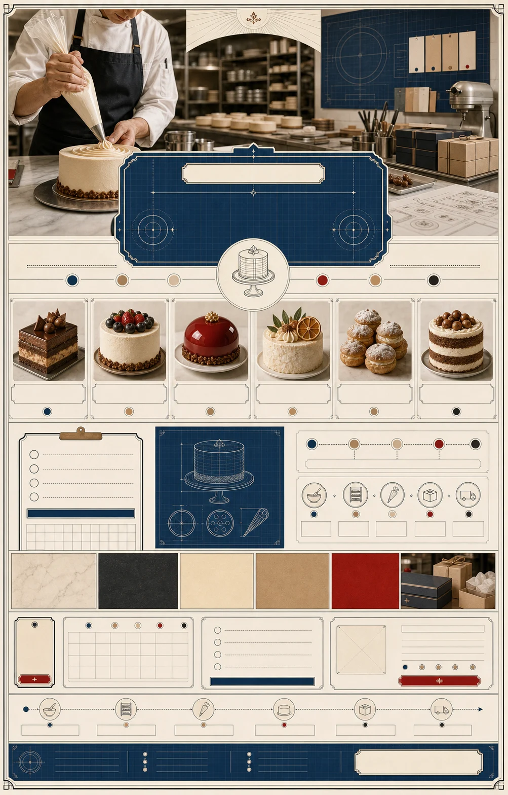
3 more prompt-tracked specimens
- Vertical seasonal patisserie launch campaign visualCampaign plate
- Horizontal seasonal patisserie launch campaign bannerCampaign plate
- Square patisserie product editorial campaign visualCampaign plate
Responsive previews
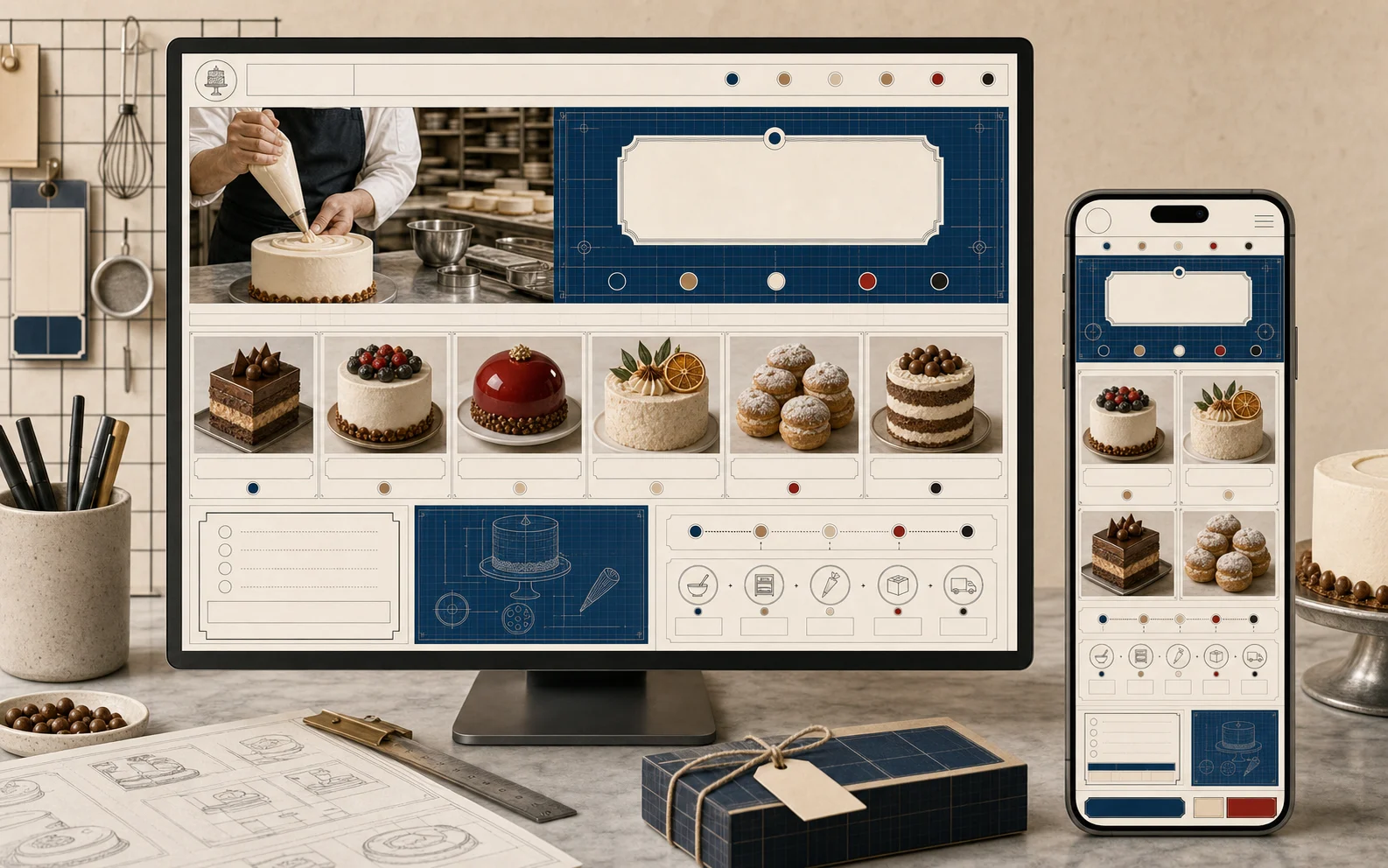
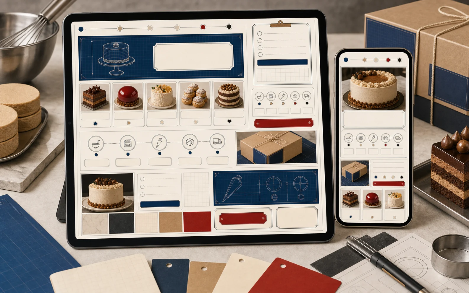
Responsive previews are proof notes. They are grouped as device evidence rather than treated as another decorative image.
Mobile, tablet, and device previews that prove the design language works across viewports.
- Why it exists
- These previews prove the system can move from desktop atmosphere into practical mobile evaluation.
- Feeling
- Stable and reassuring: identity should survive the smaller frame without losing hierarchy.
- Role
- Responsive previews
- Count
- 4
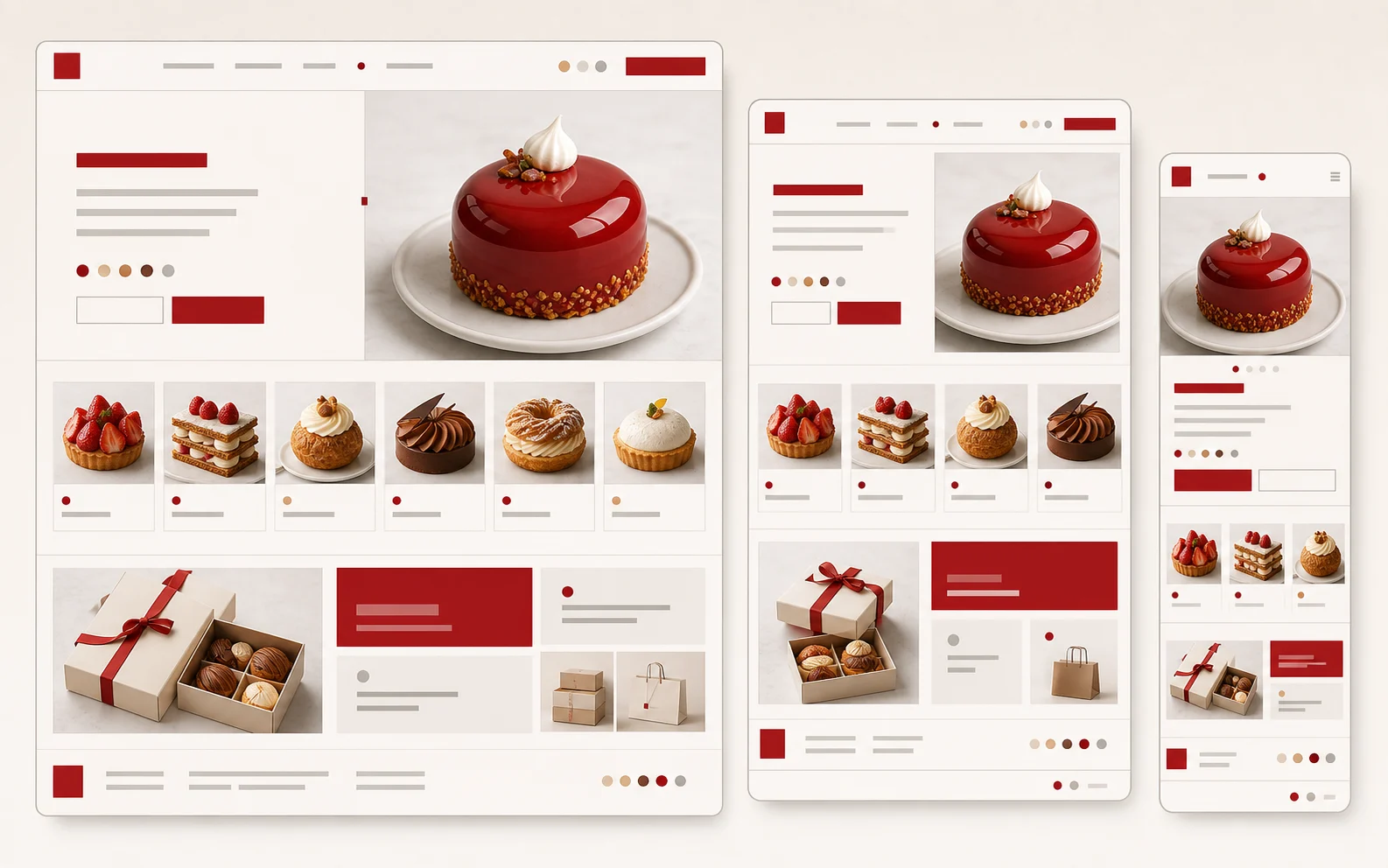
1 more prompt-tracked specimens
- Desktop and mobile patisserie catalogue responsive previewResponsive Preview
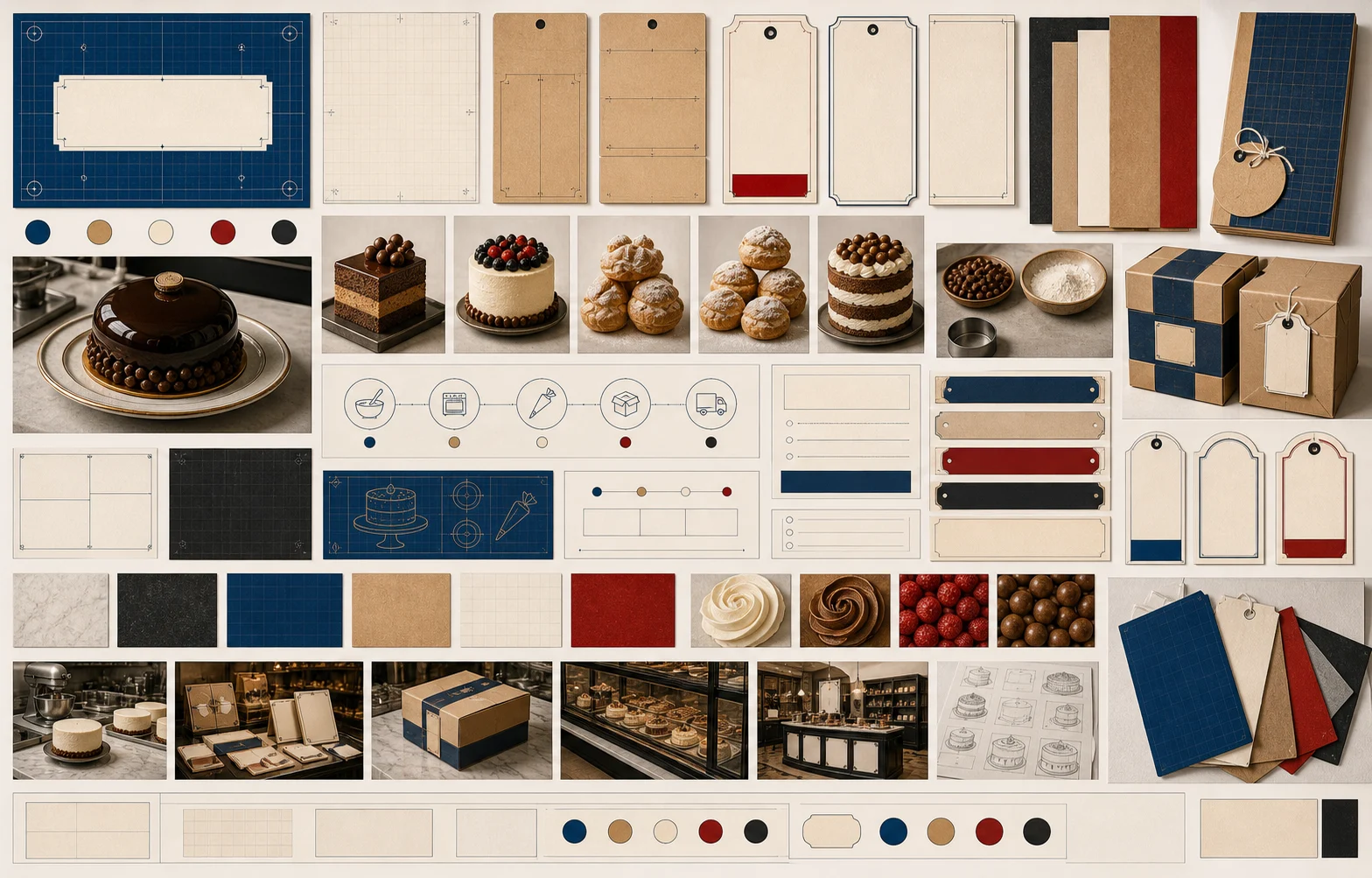
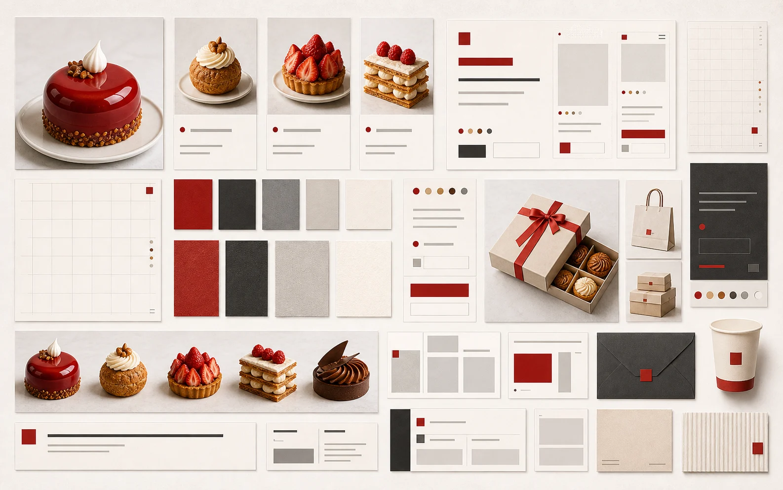
Moodboard plates
Moodboard plates summarize the period vocabulary: materials, type, color, and framing logic in one reference sheet.
Curated plates that summarize the period mood, materials, type, and layout references.
- Why it exists
- These plates establish the vocabulary that keeps generated imagery, materials, and components coherent.
- Feeling
- Editorial and connective: the plate should explain why the group belongs together before any single specimen is judged.
- Role
- Moodboard plates
- Count
- 2
Prompt-tracked inventory list
Showcase scenes
- catalogue hero and documentation-oriented template preview
- docs and component catalogue template preview
- Bakery lab production planning scene for Atelier Blueprint catalogue and landing imagery
- Made-to-order studio consultation scene for commercial website storytelling
- Production packing workflow scene for made-to-order service pages
- Production review wall scene for bakery lab or custom studio pages
- Made-to-order pickup and ordering workflow for service pages
- Production calendar and batch-prep scene for operational storytelling
- Contemporary patisserie retail counter scene for catalogue, landing, and gallery usage
- Contemporary patisserie packing and pickup scene for catalogue, landing, and gallery usage
- Magazine-shop patisserie display scene for catalogue, landing, and gallery usage
- Top-down seasonal patisserie product editorial scene for catalogue and gallery usage
- Patisserie launch photography studio scene for catalogue, landing, and gallery usage
- Patisserie subscription and gifting counter scene for catalogue, landing, and gallery usage
Template previews
- Full landing page template preview for Atelier Blueprint website kit
- Order-detail template preview for made-to-order production atelier
- Public-facing production planning template preview for bakery batch pages
- Mobile-first template preview for bakery lab or craft studio pages
- Product catalogue and specification template preview
- Full-page seasonal launch website template preview
- Magazine-shop patisserie website template preview
- Patisserie ecommerce collection template preview
- Patisserie editorial article and shop template preview
- Mobile-first patisserie landing template preview
Component details
- Component sheet for order forms, status modules, and product cards
- Production order card component close-up for bakery lab websites
- Product-card and specification component detail for catalogue modules
- Process timeline component detail for production workflow explanation
- Small-screen control component detail for order and specification modules
- Flat patisserie product matrix component detail
- Patisserie pickup scheduler component detail
- Patisserie editorial caption component detail
- Seasonal patisserie campaign card component detail
- Patisserie product comparison table component detail
Material textures
- grid-led paper texture for documentation and catalogue surfaces
- Blueprint grid paper texture for Modern Classic Atelier Blueprint surfaces
- Warm specification-paper texture for cards and page backgrounds
- Graphite production-grid texture for dark panels and documentation cards
- Pale kraft production-card texture for product and documentation modules
- Warm editorial grid paper texture for Modern Patisserie Editorial surfaces
- Neutral product-photography backdrop texture for catalogue cards
- Matte charcoal packaging paper texture for Modern Classic cards
- Warm cream menu-card stock texture for Modern Patisserie Editorial backgrounds
Cutouts and decorators
- reusable typographic or grid marker accent
- Modern Classic connected grid marker
- Modern Classic modular frame marker
- Modern Classic caption card
- Modern Classic modular bracket for documentation examples and catalogue grouping
- Modern Classic pricing tab for plan comparison and implementation sections
- Modern Classic axis marker for documentation grids and component catalogue anchors
- Reusable isolated blueprint measurement tag for Atelier Blueprint pages, previews, and UI compositions
- Reusable isolated blueprint production-label ornament for Atelier Blueprint pages, previews, and UI compositions
- Reusable isolated atelier batch-card ornament for Atelier Blueprint pages, previews, and UI compositions
- Reusable isolated measurement-divider ornament for Atelier Blueprint pages, previews, and UI compositions
- Blueprint measurement bracket for made-to-order modules, production cards, and batch-planning UI
- Batch tab for production rows, order states, and blueprint-style process headers
- Production ruler for made-to-order modules, specification rows, and bakery lab planning
- Batch stamp for bakery lab states, production cards, and order confidence panels
- Order window frame for product image slots, order cards, and made-to-order previews
- Measurement divider for process steps, specification rows, and production notes
- Specification tag for production specs, made-to-order cards, and bakery lab modules
- Proofing grid corner for production preview frames, order cards, and process panels
- Production batch plaque for bakery lab status panels, batch states, and order confidence modules
- Work order frame for product image slots, order cards, and made-to-order previews
- Process step label for workshop flow, bakery lab stages, and production status panels
- Material spec corner for product documentation cards, specification panels, and proofing layouts
- Made-to-order plaque for production atelier service cards, order details, and batch confidence modules
- Production window label frame for bakery lab scheduling, batch timing, and order cards
- Reusable isolated editorial product launch label for Modern Patisserie Editorial pages, previews, and UI compositions
- Reusable isolated issue-launch card ornament for Modern Patisserie Editorial pages, previews, and UI compositions
- Reusable isolated product-caption strip ornament for Modern Patisserie Editorial pages, previews, and UI compositions
- Reusable isolated editorial grid marker ornament for Modern Patisserie Editorial pages, previews, and UI compositions
- Issue marker for seasonal product launches, editorial collection cards, and magazine-style commerce
- Caption strip for product-grid notes, seasonal rows, and issue-led launch panels
- Product-grid frame for contemporary patisserie launches, image cards, and editorial previews
- Collection number marker for seasonal product drops, editorial cards, and issue-led launches
- Editorial photo mat for product photography frames, seasonal launch previews, and image cards
- Price caption strip for product cards, seasonal launch rows, and editorial commerce modules
- Product drop label for seasonal launch cards, editorial commerce rows, and product cards
- Editorial grid corner for product grid cards, issue layouts, and contemporary patisserie frames
- Launch ribbon for seasonal launch rows, editorial product sections, and issue-led announcements
- Season label for contemporary patisserie launch cards, issue headers, and product rows
- Product card frame for contemporary patisserie catalogue cards, seasonal issue layouts, and product-image slots
- Caption corner for editorial product photography, image grids, and product detail cards
- Launch tag for product drops, seasonal issue modules, and restrained commerce labels
Campaign plates
- Vertical campaign card for made-to-order bakery lab launch
- Square social launch card for production atelier service
- Horizontal campaign banner for made-to-order bakery lab or atelier site
- Vertical seasonal patisserie launch campaign visual
- Horizontal seasonal patisserie launch campaign banner
- Square patisserie product editorial campaign visual
Responsive previews
- Desktop and mobile responsive preview for Atelier Blueprint website
- Tablet and phone responsive preview for made-to-order request and production tracking pages
- Responsive multi-device seasonal patisserie launch preview
- Desktop and mobile patisserie catalogue responsive preview
Moodboard plates
- Moodboard plate for Atelier Blueprint material, layout, component structure, and made-to-order workflow
- Modern Patisserie Editorial moodboard plate for period overview and visual-library gallery usage
Other design systems
Return to homepageRoute: /design-systems/modern-classic